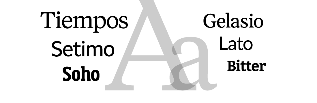
Amherst has six typeface families to choose from, providing flexibility for your design needs. Tiempos, Setimo, and Soho are our primary typefaces, used in Amherst College logos and other visual identity pieces. Three additional fonts — Gelasio, Lato, and Bitter — are more broadly available and can be used by College departments for a variety of on-campus communications.
AMHERST COLLEGE DEPARTMENTS: If you need a logo for your department or program, please submit a design request to Communications and we will make one for you. Please do not make logos on your own. Amherst typefaces may be used freely in collateral materials, but logos require more specific typographical treatments.

Tiempos
The serif typeface used in Amherst’s wordmark, on the College website, and in a wide variety of Amherst digital and print design is Tiempos. This distinctive typeface includes four regular weights and six headline weights. It expresses the classic, academic, and collegiate qualities of the Amherst identity.
Email commassets@amherst.edu for information on acquiring Tiempos. Note that our license is restricted and we cannot provide this font for all projects.


Setimo
Amherst’s official sans typeface is Setimo, used on the College website and in a wide variety of Amherst digital and print design. This versatile typeface includes three weights and is noted for its accessible design, making it comfortably readable at a wide range of sizes. Consistent use of Setimo helps reinforce the College’s identity.
Setimo is available via our brand kit in Adobe Express. Please email commassets@amherst.edu for information.

Soho
Amherst’s official athletic typeface is Soho. This impactful typeface includes four weights and a condensed width. Consistent use of Soho helps reinforce the College’s identity. All athletic wordmarks are set in Soho Bold Condensed.
Email commassets@amherst.edu for information on purchasing Soho. Note that our license is restricted and we cannot provide this font for all projects.

Gelasio
Gelasio is available for free at Google Fonts and is available in Google Apps. Sharing many of the qualities of Tiempos, Gelasio is available in four weights and is an elegant choice for your documents and informal designs.

Lato
Lato is available for free from Google Fonts and is available in Google Apps and Adobe Express. Sharing many of the qualities of Setimo, Lato is available in five weights. Equally elegant in digital and print, Lato is a versatile choice for your documents and informal designs.

Bitter
Bitter is available for free at Google Fonts and is available in Google Apps. Sharing many of the qualities of Soho, Bitter is available in nine weights (plus italics, not shown) and may be used in your documents and informal designs.
